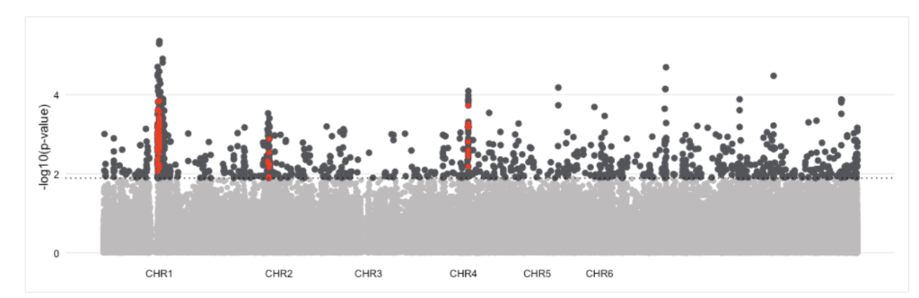
This type of figure is often used to visualize GWAS data. It displays the statistical significance of associations between genetic variants and the study’s focus trait. The peaks represent the variants that are significantly associated with the trait, while the horizontal line represents the threshold for significance.
From supplementary materials of Winchell et al. (2023, PNAS)